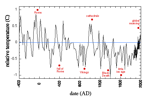
Temperature in the last 1000 yearsThe temperature data from Greenland ice cores is a good starting point:
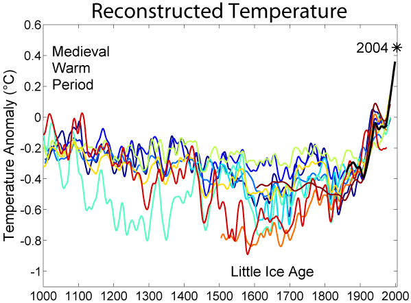
The zero point of temperature is the 1950 temperature. You can see the Medieval Warm Period around 1000 AD, and the Little Ice Age around 1600 AD. The graph shows that it was warmer around 1000 AD than it is now. Since no fossil fuels were being burned in 1000 AD, the Medieval Warm Period must have been due to natural causes, and if this graph is really correct, it leads naturally to the suggestion that possibly natural causes are at work again. There has, however, been some controversy about the Little Ice Age and the Medieval Warm Period, as well as considerable controversy about the temperature in the last 20 years. Before taking up these controversies, we have to consider the sources of temperature data for the last 1000 years. Since 1994, we have had satellites in orbit whose specific purpose was to gather data on temperature. Before that, going back to 1864, there have been ground stations measuring local surface temperatures with thermometers. But if we want temperature data going back more than 150 years, we certainly don't have records of thermometer measurements, and we must rely on "reconstructions" of temperature from other "proxies". A proxy is some other quantity (for example ratios of one kind of oxygen isotope to another in air bubbles trapped in ice), which depends on temperature in a known way, and has left some measurable trace. Here is a graph (taken from the Wikimedia Commons) of ten different reconstructions of temperature over the last 1000 years. The black line starting in 1864 is not a reconstruction, but is instrumental data. Note that the graph stops in 2000 and none of the reconstructions goes past 1995. There is no reason to be interested in proxies for temperature past 1994, when we have both ground stations and satellites. The zero point of the temperature scale is the 1961-1990 average, which is some 0.2 degrees higher than the 1950 temperature that serves as the zero point for the first graph.
The reconstructions used, in order from oldest to most recent publication are:
(black 1856-2004): Instrumental data was jointly compiled by the Climatic Research Unit and the UK Meteorological Office Hadley Centre. Global Annual Average data set TaveGL2v [2] was used. Documentation for the most recent update of the CRU/Hadley instrumental data set appears in: P.D. Jones and A. Moberg (2003). , Journal of Climate, 16: 206-223. Copyright: The original version of this figure was prepared by Robert A. Rohde from publicly available data and is incorporated into the Global Warming Art project. DiscussionIt is confusing that the zero point is not the same on both graphs. The first one has its zero at the 1950 temperature. The second one follows the IPCC convention and takes the zero point to be the 1961-1990 average. That is perhaps 0.2 degrees higher than the 1950 temperature. Even so, the second graph is not showing temperatures as high as the first one during the Medieval Warm Period; and it does not show that the temperature in 1000-1100 was ever as high as in 2000. Why is there no data for the Greenland ice core data in the second graph? It is based on the accurate proxy of oxygen isotope ratios in trapped air bubbles; the atmosphere mixes enough that these isotope ratios measure global temperature and not just Arctic temperature. I haven't seen anyone arguing about the accuracy of the oxygen-isotope proxy. So was it, or wasn't it, as warm in 1050 AD as it is now? A second point of controversy about the Medieval Warm Period is whether it was, or was not, global. Perhaps only some parts of the world were warm then. These questions need to be considered together, as the way to investigate them is the same: Scientists go to some particular location and take data on some particular proxy, and arrive at the conclusion that at that place, the temperature during the Medieval Warm Period was such-and-such. We are in the process of compiling the results of these investigations. |
Michael Beeson's Home Page
-->